director's desk: post-COVID paradiso
For an adult to travel to Italy for the first time, let alone a designer who had never been to Europe, was nothing short of daunting. The trip was centred around one of the largest design fairs in the world, and yet, design hadn’t been the primary draw in going to Italy for the majority of my life (though it certainly came a close second). The original inspiration for me had been La Divina Commedia, or The Divine Comedy, written by Dante Alighieri between 1308 to 1321, in his home city of Florence.
It begins with one of the most notable lines in fiction:
Midway upon the journey of our life / I found myself within a forest dark, / For the straightforward pathway had been lost.
I became very aware as I was travelling that this masterful work rings particularly true to the times we live in today. Making it through a never-ending spin cycle of global trials has oftentimes felt bleak, dark, and uninspiring. However, like Dante, we have the option of pushing through the gloom - persevering to discover something magnificent, our own Paradiso.
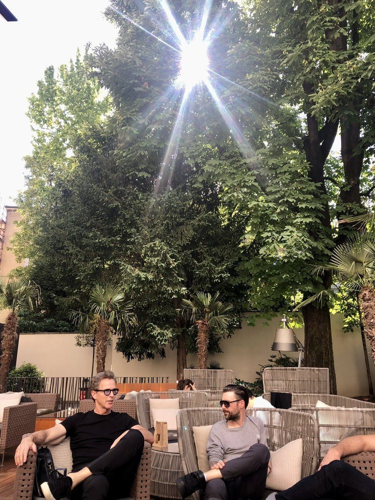
Seeing Italy after the COVID pandemic made me feel nothing but gratitude for other human beings. There was a lightness, a carefree sense of play and exploration, and a return to some semblance of normality. We ate well, we made new friends, and we explored design in ways I didn’t know one could. Our group challenged each other to think critically about these experiences through different lenses, asking thought-provoking questions and pushing each other to understand each touchpoint with renewed clarity. The excitement was palpable whether you were inside the walls of Salone del Mobile, strolling through the Brera to explore Fuorisalone, or simply meandering towards every gorgeous object, building, or space that happened to peek out around every corner.
Upon reflection, I distinctly noted that there was that word - lightness - underscoring every interaction. The heavy, dark, and overconsumed gave way to the bright, bold, and timeless. Light itself was used throughout every space to create drama, to play with simplicity; to explore our emotional experience in a space. The most striking interiors applied this technique with almost clinical precision. Light created room to breathe; it highlighted the way forward.
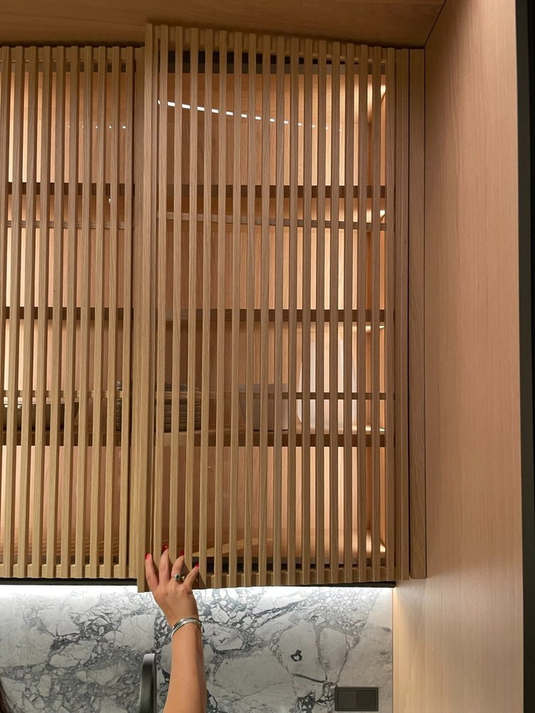
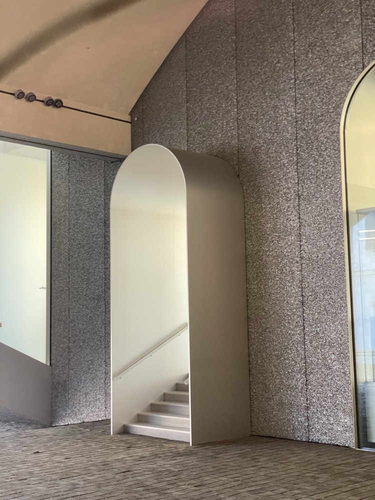
Many of the most impactful things we explored reduced their ornamentation and returned to simple materials. Textures invited touch, and Cheryl mused upon our return that it seemed as if we were experiencing the slap-back to not being able to touch surfaces after so long. We grazed our hands along every plane we could, feeling the raw stone, the hand-etching, the cold steel, the rough wood for every grain, pit, divot, or bump we could find. The materiality stayed simple and beautiful; gone were the pure white marbles, the faux-looking plastics, the fake and processed. If stone was used it was natural, warm, inviting, and simple, or it was a bold statement, invoking sparkling tones in jade greens and stunning golds.
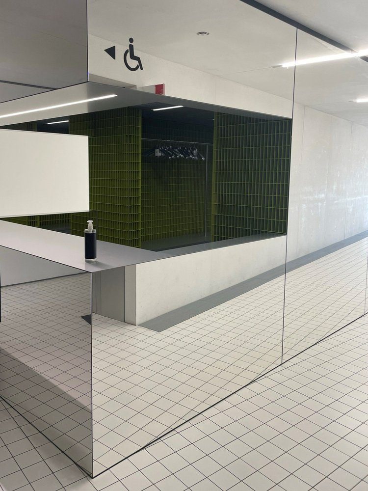
Metal took on a bigger stage and was used in many of its classic forms: gold, titanium, and stainless, with or without a beautiful patina. Mirror and glass – pure for the former, fluted for the latter – played creatively with their environments. These reflective pieces would connect with the user, the human interaction with these static elements seemingly completing the space. In other instances, these forms or materials would incorporate site context, pulling it into the space as another design element, while still maintaining its base materiality.
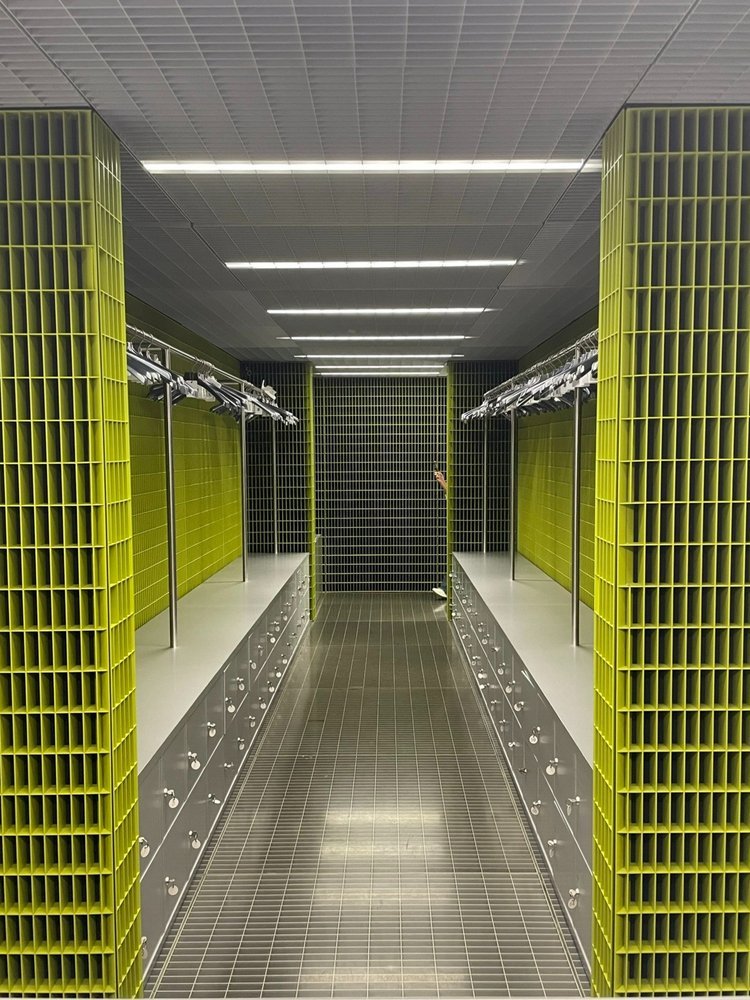
This simplicity was echoed throughout the designed spaces outside of the halls of Salone as well. From the boldest of minimal gallery spaces (Fondazione Prada) to flag-ship fashion locations (Acne Studios or Gucci Garden), and even to local burger joints (Bun Burger), the design world had taken on one of two forms: Essential Austerity or Hyper-Trends. In the first, minimal materiality was employed to allow site context and design language to reign supreme. These spaces force the user to bring themselves fully into their immediate surroundings, as there was minimal decoration, if any. In the Hyper-Trend spaces, we were brought into exhibition-like creations that would not stand the test of time in any traditional sense. Instead they created capsules of design outside of our usual method of trend chasing, usually in overtly bold reactions to our current moment.
These spaces and themes that permeated our time in Italy led me to more compelling questions. Will we now experience the world around us through heightened tactility and an increased focus on context? Will we continue to polarize into stoic minimalism versus exhibition-esque displays of ephemerality? And how will we structure our spaces to react to such persistent, upending change? At one talk our party attended, an all encompassing question was posed - “What does Post-Pandemic luxury look like?”
As we carry on with our journeys, much like Dante wearily grinds toward Paradiso, I think this question evolves into something broader: What does Post-Pandemic anything look like, and how will design respond? For now, these answers are still to be explored, yet a few things I now see with renewed value: connection with friends, thoughtful design considerations, and the importance of searching for the lightness that keeps us all moving forward.
I wanted to send a massive thank you to our gracious hosts, Harvey, Vanessa, with much help and support from Laura. You all took the role of my Virgil at one point or another, and it was such an honor and a pleasure to get that opportunity with you all. To our teams that travelled with us, thank you for some wonderful memories and adventures. Here’s to many more.

